ENEnglish
 LTLietuviškai
 DEDeutsch
 FRFrançais
 RUРусский
 ESEspañol
 PLPolski
 ITItaliano
 UKУкраїнська
 CSČeština
 PTPortuguês
 JA日本語
JA日本語 LVLatviešu valoda
 ETEesti
 HUMagyar
 IDBahasa Indonesia
 TRTürkçe
 HIहिन्दी
 ELΕλληνικά
 ARالعربية
 THไทย
THไทย VITiếng Việt
 RORomână
 MSBahasa Melayu
 BNবাংলা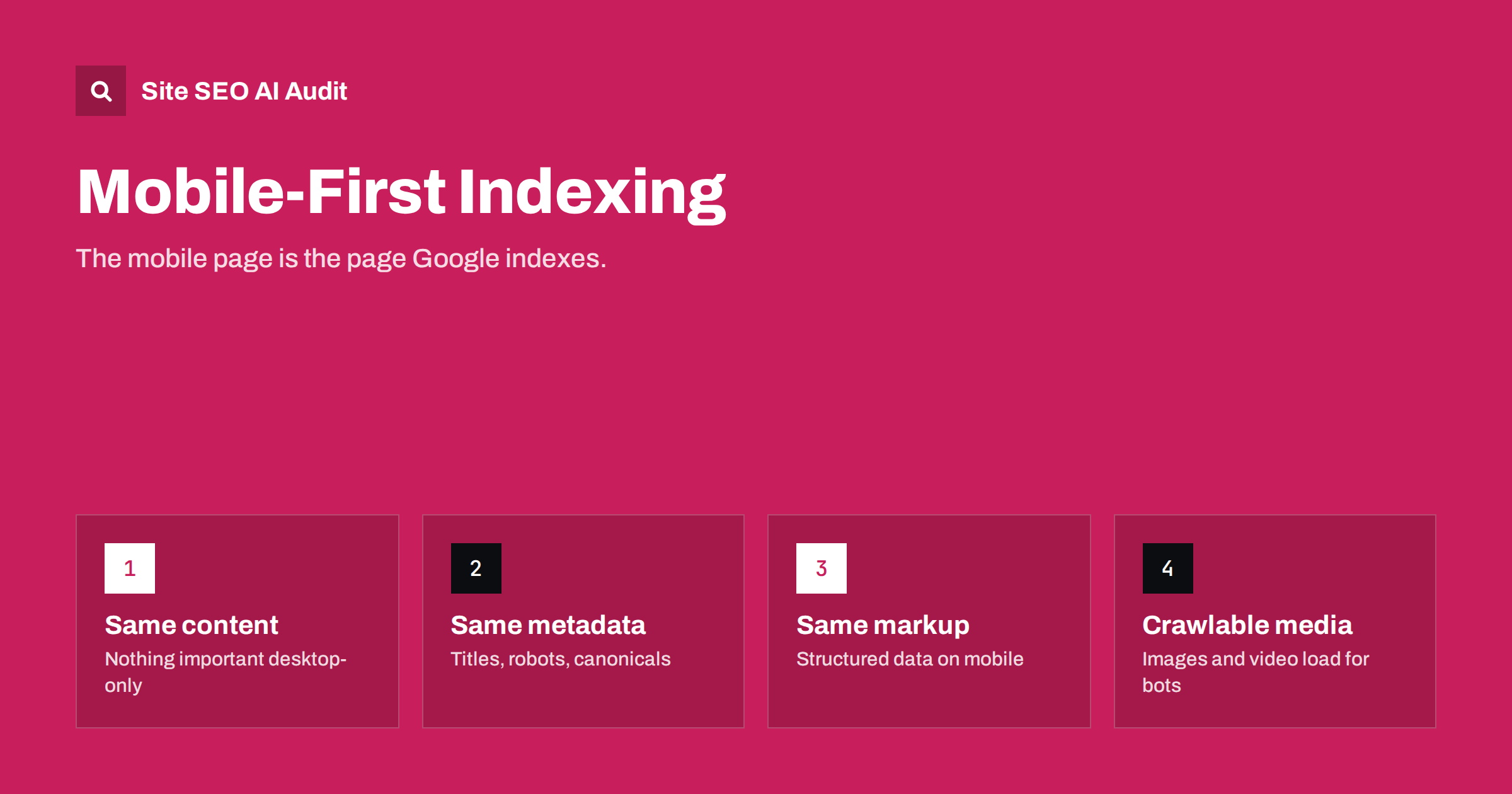
Short answer: with mobile-first indexing, Google mainly crawls and indexes the mobile version of your pages and uses it for ranking. Anything that exists only on desktop, such as text, links, structured data or images, may effectively not exist for search. Use a responsive design where possible, and if mobile and desktop differ, make sure the mobile version has the same primary content, headings, links, metadata, structured data and crawlable media.
What mobile-first indexing means
For most of the web’s history, search engines looked at the desktop version of a page. As most searches moved to phones, Google switched to using the mobile version as the primary one for crawling, indexing and ranking. The switch has been completed for virtually all sites; Google’s documentation on mobile-first indexing best practices describes what it expects.
In practice this means Googlebot visits your pages mostly with a smartphone user agent and a mobile viewport. Whatever it sees there is what gets indexed. The desktop version still matters for desktop visitors, but it is no longer the reference for search.
This is easy to forget when a site is designed and reviewed on large screens. Owners, designers and developers often check new pages on a laptop, approve them and move on, while the mobile layout quietly drops a sidebar, shortens a description or swaps a menu. None of that looks like an SEO change, yet for search it can mean the page lost content and links.
Who needs to worry
How much work mobile-first indexing requires depends on how your site serves mobile visitors:
| Setup | كيف يعمل | Risk |
|---|---|---|
| Responsive design | Same HTML and URL, layout adapts with CSS | Low, as long as content is not removed on small screens |
| Dynamic serving | Same URL, different HTML depending on user agent | Medium: mobile HTML may be missing content |
| Separate mobile URLs | Mobile site on m.example.com or similar | High: content, links, annotations must all be mirrored |
Responsive design is the simplest and the one Google recommends. But even responsive sites can run into trouble when themes hide content on mobile, or when JavaScript loads different content depending on screen size.
What must match: the parity checklist
Parity means that the version Googlebot smartphone sees carries everything that matters for search on the desktop version. Five areas cover almost every parity problem found in practice.
Content parity
The most important rule: primary content must be the same on mobile and desktop. Check for:
- Text removed on mobile to “simplify” the layout, such as category descriptions, product details or long-form sections.
- Tabs and accordions. Content inside them is fine for indexing as long as it is in the HTML. Content loaded only when a tab is tapped is not.
- Lazy loading that requires interaction, such as reviews loaded only on tap or “read more” buttons that fetch text.
- Different headings on mobile, which can change what a page appears to be about.
- Mobile-only interstitials that cover the content, which also hurt users.
Links and navigation
Internal links on the mobile version are the links Google uses to discover and value pages. Mobile menus and footers are often reduced to save space, which quietly removes links:
- Make sure important category and hub pages are linked in the mobile navigation, even if nested.
- Check that mobile menus use real
<a href>links in the HTML, not links built only after a tap by JavaScript. - Do not drop related-product, related-article or breadcrumb links on mobile.
- Compare the number of internal links on a mobile and desktop version of the same page; large differences need explaining.
Metadata and directives
These must match exactly, or be correct in the mobile version:
- Title and meta description.
- Meta robots. A
noindexornofollowon mobile applies to the indexed version. - Canonical tags. On separate mobile URLs, the mobile page should have a canonical to the desktop URL and the desktop page a
rel="alternate"pointing to the mobile URL, following Google’s guidance for separate URLs. - hreflang on multilingual sites, pointing mobile URLs to mobile URLs where separate mobile sites exist.
- robots.txt on a separate mobile host must not block what the desktop host allows.
البيانات المنظمة
If your structured data is output only on desktop, for example because a plugin adds it in a desktop-only template part, it will not be seen. Check that Product, Article, BreadcrumbList, Organization and other markup appears on the mobile version, with the same values and URLs. On separate mobile sites, URLs inside the markup should be the mobile URLs.
Images and video
- Use the same high-quality images on mobile; do not swap them for tiny thumbnails.
- Keep the same alt text on mobile images.
- Make sure image URLs are stable, not regenerated on every load.
- Do not lazy-load images in a way that requires scrolling or tapping to trigger.
- Videos should be in supported formats, placed where they are easy to find on the mobile page, and have the same structured data as on desktop.
Parity problems in themes and page builders
On WordPress and similar platforms, most parity problems are not deliberate. They come from design settings that look harmless:
- “Hide on mobile” switches in page builders. Sections hidden this way are sometimes removed from the HTML rather than hidden with CSS, depending on the builder and its settings. Check the mobile HTML, not just the visual result.
- Separate mobile headers and menus that contain fewer links than the desktop mega menu.
- Sidebars that disappear on small screens, taking category lists, popular posts and related links with them.
- Sliders replaced by a single image on mobile, where the text of the other slides vanishes.
- Mobile plugins or AMP-style add-ons that serve a simplified template without structured data or breadcrumbs.
A practical test is to pick three typical pages, save the HTML as served to a mobile user agent and to a desktop one, and compare word counts, headings, link counts and the presence of structured data. If the numbers are close, parity is probably fine. If the mobile version is much smaller, find out what the theme removes.
Performance and usability on mobile
Mobile-first indexing is about which version is indexed, not directly about speed. But the same mobile pages are the ones measured for Core Web Vitals on mobile, and most visitors use them. Common mobile problems worth fixing alongside parity:
- slow LCP from large hero images and slow servers on mobile networks;
- poor INP from heavy JavaScript on mid-range phones;
- layout shifts from banners and ads inserted at the top;
- text too small to read and tap targets too close together;
- intrusive pop-ups that hide the content right after arriving from search.
How to check mobile parity
- URL Inspection in Search Console shows the crawled page as Googlebot smartphone saw it, including rendered HTML and screenshot.
- Compare raw HTML by requesting the page with a mobile and a desktop user agent and comparing word count, headings, links, canonical, robots and structured data.
- Use browser device mode to view the page at mobile width and check what is hidden, collapsed or missing.
- Crawl the site as a mobile user agent and compare with a desktop crawl. Differences in page counts, links or titles show parity problems at scale.
Separate mobile sites: consider consolidating
If you still run a separate mobile site on an m-dot subdomain, every page, link, annotation and piece of markup must be maintained twice, and errors in the pairing are common. For most sites, moving to responsive design is the most reliable long-term fix. It is a migration in its own right, so plan redirects from mobile URLs to their responsive equivalents and follow a normal migration checklist.
How Site SEO AI Audit helps
SEOAuditBot crawls your pages and records titles, headings, canonicals, robots directives, internal links and structured data on every page, while the speed area uses Google PageSpeed data including mobile LCP and CLS. Missing markup, missing canonicals, weakly linked pages and slow templates all show up with the affected URLs, which helps you spot pages where the version search engines see is thinner than it should be. You can run a free audit.
Related reading
- Core Web Vitals explained: LCP, INP and CLS in plain words
- JavaScript SEO basics: how search engines render your pages
- Structured data errors: how to find and fix invalid schema
The bottom line
Google indexes what it sees on mobile. Keep the same primary content, headings, links, metadata, structured data and media on the mobile version as on desktop. Responsive design makes this easiest; separate mobile sites need careful mirroring. Verify with URL Inspection and a mobile crawl rather than assuming.
الأسئلة الشائعة
Does mobile-first indexing mean desktop does not matter?
Desktop still matters for desktop visitors, but Google mainly uses the mobile version for indexing and ranking. Anything that exists only on desktop may not count for search.
Is content in accordions or tabs indexed?
Yes, if it is present in the HTML when the page loads. Content that is fetched only when a visitor taps a tab or button may not be seen by Googlebot.
Do I need a separate mobile site?
No. Google recommends responsive design, which uses the same URL and HTML for all devices. Separate mobile sites are harder to maintain and easier to get wrong.
How do I know Google uses the mobile version of my site?
URL Inspection in Search Console shows which crawler fetched the page, typically Googlebot smartphone. For nearly all sites today, the mobile crawler is the primary one.
Can hiding text on mobile hurt rankings?
If the text is removed from the mobile HTML, Google may not index it, so the page can lose relevance for queries that text supported. Hiding it visually with CSS while keeping it in the HTML is less risky.