ENEnglish
 LTLietuviškai
 DEDeutsch
 FRFrançais
 RUРусский
 ESEspañol
 PLPolski
 ITItaliano
 UKУкраїнська
 CSČeština
 PTPortuguês
 JA日本語
JA日本語 LVLatviešu valoda
 ETEesti
 HUMagyar
 IDBahasa Indonesia
 TRTürkçe
 HIहिन्दी
 ELΕλληνικά
 ARالعربية
 THไทย
THไทย VITiếng Việt
 RORomână
 MSBahasa Melayu
 BNবাংলা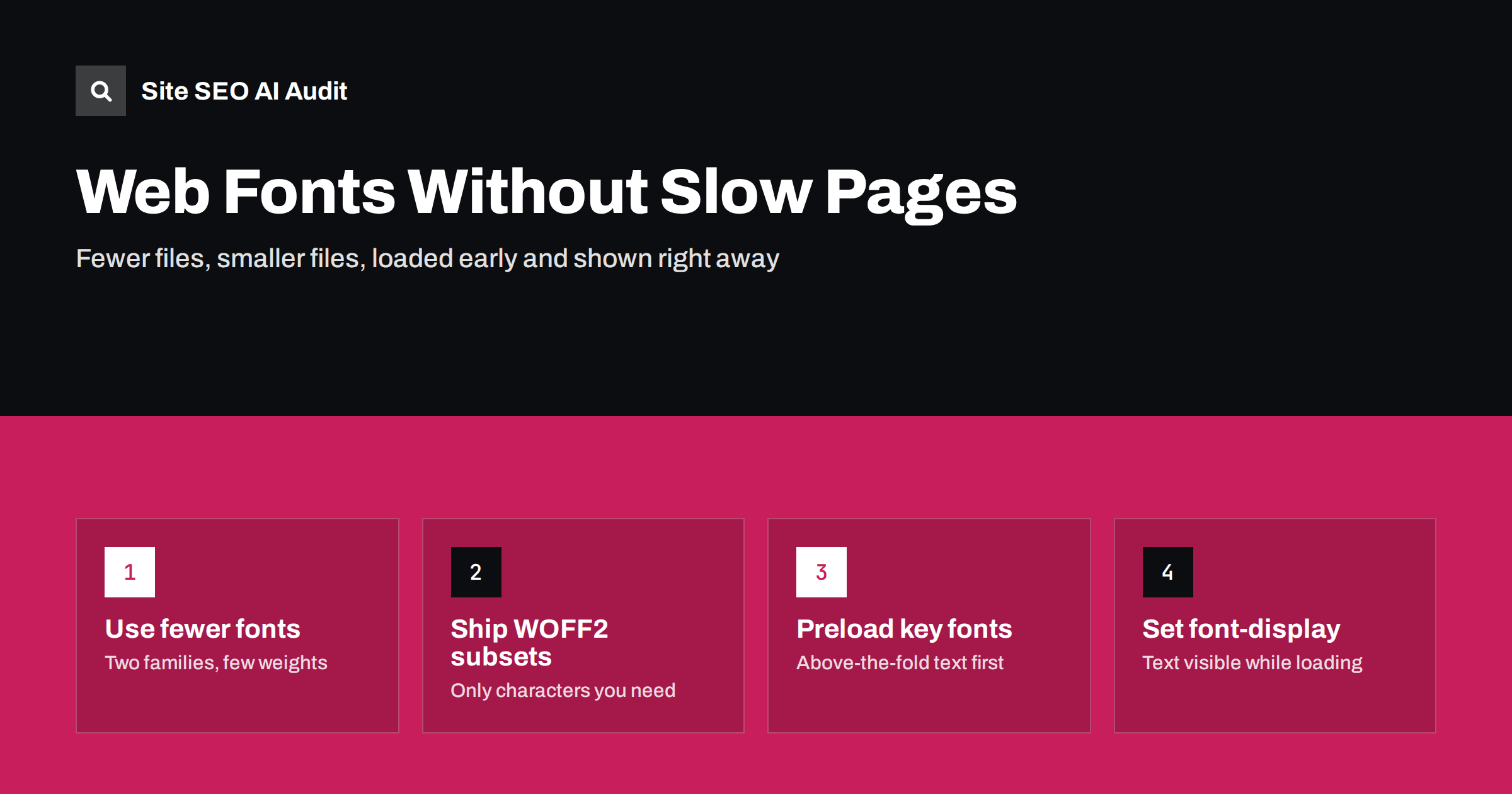
Short answer: Web fonts hurt SEO only indirectly, through slower loading, invisible text and layout shifts that worsen Core Web Vitals. Keep them fast by using few families and weights, serving WOFF2 files subset to the characters you need, self-hosting or preloading the one or two fonts used above the fold, and setting font-display so text appears immediately. A fallback font with matched metrics prevents the jump when the web font arrives.
Typography is part of a brand, and nobody needs to give it up for speed. But fonts are often the most overlooked part of page weight: a theme that loads four families in six weights each can add hundreds of kilobytes and several extra connections before a single word is readable. The good news is that font problems are some of the easiest speed problems to fix.
How fonts affect speed and Core Web Vitals
A browser cannot draw text in a web font until the font file has been downloaded. While it waits, it either shows nothing or shows a fallback font. Both choices have costs:
- Invisible text. If the browser hides text while waiting, visitors see an empty layout. When the main heading or first paragraph is the largest element on screen, this delays Largest Contentful Paint.
- Layout shift. If the browser shows a fallback and then swaps in the web font, lines can get longer or shorter, pushing content around. That adds to Cumulative Layout Shift.
- Extra requests. Fonts from a third-party server need a DNS lookup, a connection and often a CSS file before the font file itself. On slow mobile connections each step adds delay.
- Page weight. Every family, weight and style is a separate file. Unused weights are pure waste.
Core Web Vitals are part of how Google assesses page experience, but they are not a magic ranking switch. The real reason to fix fonts is that visitors see and read your content sooner. For background on the metrics, see Core Web Vitals explained.
Step 1: Audit what your site loads
Before changing anything, find out what is actually loaded. Open your home page and a typical article in the browser developer tools, go to the Network tab, filter by “Font”, and reload.
- How many font files load? More than four or five on one page is usually a sign of waste.
- Which formats? WOFF2 should be the norm; older TTF or EOT files are larger.
- Where do they come from: your own domain, a font service, or a plugin?
- Are weights loaded that the design never uses, such as 100, 200 or 900, or italics nobody sees?
WordPress sites often load the same font twice: once from the theme and once from a page builder or plugin. Icon fonts are another common hidden cost, loading a whole file to show a handful of symbols.
Step 2: Use fewer families and weights
The fastest font is the one you do not load. Most well-designed sites work with one family for text and, at most, one for headings. Within each family, regular and bold usually cover body text; one extra weight for headings is plenty.
- Drop unused weights and styles. If italic is used only in a few quotes, the browser can create a synthetic italic, or you can accept the regular style there.
- Consider variable fonts. One variable font file can contain many weights. If you use three or more weights of a family, a variable version is often smaller than separate files. If you use only one or two, separate static files may be lighter.
- Consider system fonts for body text. A system font stack uses fonts already installed on the device and costs nothing to load. Many sites keep a brand font for headings and use system fonts for long text.
- Replace icon fonts with inline SVG. SVG icons load only what is used and do not depend on a font file.
Step 3: Serve small files: WOFF2 and subsetting
WOFF2 is a compressed font format supported by all modern browsers. It is typically noticeably smaller than older formats, so it should be the only format most sites need today.
Subsetting removes characters you never use. A full font may include Latin, Cyrillic, Greek and Vietnamese characters plus symbols. If your site is in English and Lithuanian, you need Latin and Latin Extended, not the rest. Font services usually split fonts into subsets automatically and use the unicode-range descriptor so that the browser downloads a subset only when the page contains those characters. If you self-host, you can create subsets with font tools during your build.
Be careful on multilingual sites: test every language version after subsetting, so that letters such as ą, ž, ß or ő do not fall back to a different font in the middle of a word.
Step 4: Self-host or use a font service?
| Self-hosted fonts | Third-party font service | |
|---|---|---|
| Connections | Same domain, no extra connection | Extra DNS lookup and connection, often two hosts |
| Control | You choose subsets, caching and preload | Service decides files and CSS |
| Caching | Long cache headers you set yourself | Browsers no longer share font caches across sites, so no shared-cache advantage |
| Privacy | No visitor data sent to another company | Visitor IP addresses reach the font provider |
| Effort | Some setup and licence check | Copy one line of code |
For most sites, self-hosting is now the better default: fewer connections, full control and fewer privacy questions, which matters to many businesses in the EU. Check the font licence first; most open-source fonts allow self-hosting. If you keep a third-party service, add preconnect hints for its hosts so the connection starts early.
Whichever you choose, serve font files with long cache lifetimes. Font files rarely change, and our guide to HTTP caching headers explains how to set this up.
Step 5: Load the right fonts early
The browser discovers fonts late: first it downloads HTML, then CSS, then works out which fonts the visible text needs. You can shorten this chain.
- Preload the one or two fonts used above the fold, usually the heading and body text weights, with
<link rel="preload" as="font" type="font/woff2" crossorigin>. Do not preload every font, because preloads compete with other important files such as the main image. - Put the @font-face rules in the main CSS or inline them in the page head, instead of loading an extra CSS file just for fonts.
- Avoid font CSS imported from inside another CSS file, because that adds another step to the chain.
Font loading is closely related to other render-blocking resources; see how to fix render-blocking resources for the wider picture.
Step 6: Choose font-display and match the fallback
The font-display descriptor tells the browser what to do while a font is loading.
swap: show fallback text at once and swap to the web font when it arrives. Text is visible immediately, but a visible change can cause a layout shift.optional: use the web font only if it arrives very quickly, otherwise keep the fallback for that page view. This gives the most stable layout and is a good choice for body text.fallback: a middle ground, with a short invisible period and a limited swap window.
To reduce the shift that swap causes, make the fallback font take up the same space as the web font. The size-adjust, ascent-override and descent-override descriptors let you scale a local fallback such as Arial so that line lengths and heights match closely. Some frameworks and font tools generate these values automatically. Our guide to fixing Cumulative Layout Shift covers other causes of shifts as well.
Checking the result
After changes, test on a throttled mobile connection, not only on fast office Wi-Fi. Look for:
- fewer font requests and a smaller total font size in the Network tab;
- text visible in the first screenshots of a performance trace;
- no visible jump when the web font appears;
- better LCP and CLS values in lab tests and, after a few weeks, in field data.
Speed is one of seven areas in Site SEO AI Audit. It measures Google PageSpeed, LCP and CLS, server response on every page, compression and page weight, and ranks every issue by how many points the fix adds, so you can see whether fonts are a priority or a detail on your site. The first audit is free and covers up to 100 pages; paid plans add re-audits to confirm the improvement.
Related reading
- How to fix Largest Contentful Paint
- Reduce page weight and use compression
- Third-party scripts and speed
The bottom line
Fonts slow pages when there are too many of them, they are too large, they load too late or they hide text. Use one or two families with few weights, serve subset WOFF2 files, preferably from your own domain, preload only the fonts needed above the fold, and pick a font-display value with a matched fallback. You keep your typography, and visitors see your content sooner.
الأسئلة الشائعة
Do web fonts affect Google rankings?
Not directly. Fonts can slow down loading and cause layout shifts, which affect Core Web Vitals and user experience. Fixing them helps visitors first, and page experience signals second.
Is font-display: swap always the best choice?
Not always. Swap keeps text visible but can cause a visible jump. For body text, optional often gives a more stable layout, while swap with a metric-matched fallback works well for brand headings.
Should I self-host Google Fonts?
For most sites, yes. Self-hosting removes extra connections, gives you control over subsets and caching, and avoids sending visitor data to another company. Check the font licence first; most open-source fonts allow it.
How many fonts should a website load?
As few as the design allows. Many fast sites load two to four font files in total, for example regular and bold of one family plus one heading weight.
Are variable fonts faster?
They can be. One variable file can replace several static weights, so it often saves space when you use three or more weights. If you need only one or two weights, static files may be smaller.