ENEnglish
 LTLietuviškai
 DEDeutsch
 FRFrançais
 RUРусский
 ESEspañol
 PLPolski
 ITItaliano
 UKУкраїнська
 CSČeština
 PTPortuguês
 JA日本語
JA日本語 LVLatviešu valoda
 ETEesti
 HUMagyar
 IDBahasa Indonesia
 TRTürkçe
 HIहिन्दी
 ELΕλληνικά
 ARالعربية
 THไทย
THไทย VITiếng Việt
 RORomână
 MSBahasa Melayu
 BNবাংলা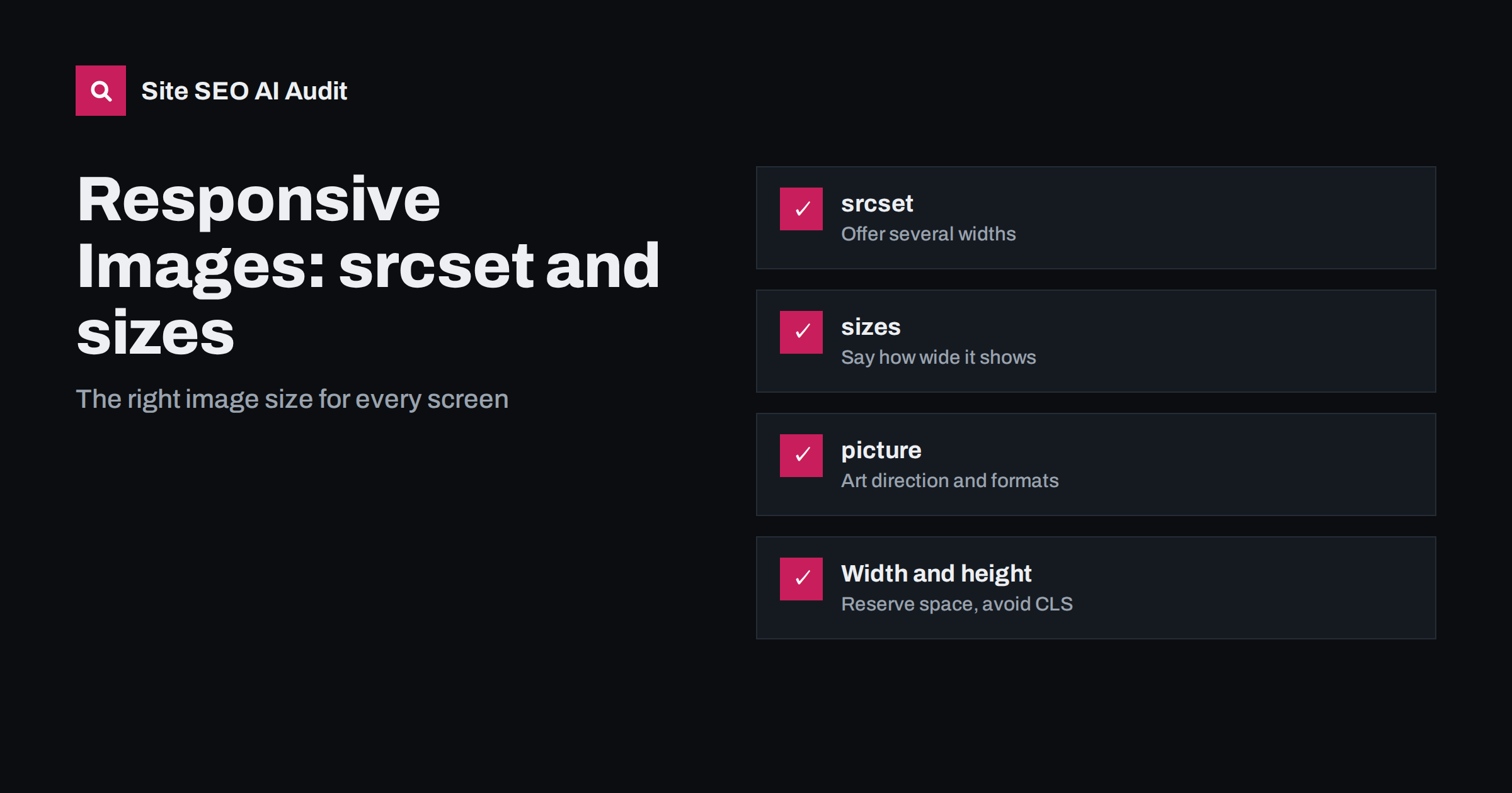
Short answer: Responsive images let the browser download an image file that fits the screen instead of one large file for everyone. You list several widths of the same image in the srcset attribute, describe how wide the image is displayed in the sizes attribute, and the browser picks the smallest file that still looks sharp. Use the <picture> element only when you need different crops or formats. Always set width and height, and never lazy-load the main image at the top of the page.
Images are usually the heaviest part of a web page, and the largest image on screen is often the element that decides Largest Contentful Paint. Many sites upload a 3,000-pixel photo and let the browser shrink it to 400 pixels on a phone. The page looks fine, but the visitor downloads several times more data than needed. Responsive images fix that without changing how the page looks.
Why one image size for everyone is a problem
A phone screen might show an article image at around 400 CSS pixels wide, a laptop at 800 and a large desktop at 1,200. High-density screens need about twice as many image pixels to look sharp. If you serve only the largest version, a phone on a mobile network downloads a file meant for a large desktop monitor. The costs add up:
- Slower LCP, because the main image takes longer to arrive. Our guide to fixing a slow LCP shows how often images are the cause.
- Higher page weight and more data for visitors on limited plans; see page weight and compression.
- More work for the device, which has to decode and scale a large image.
Serving only a small image is no better: it looks blurry on large or high-density screens. Responsive images give each device what it needs.
How srcset with width descriptors works
The most useful form of srcset lists the same image in several widths, each with a w descriptor that states the file’s real pixel width:
<img src="photo-800.jpg" srcset="photo-400.jpg 400w, photo-800.jpg 800w, photo-1200.jpg 1200w, photo-1600.jpg 1600w" sizes="(max-width: 700px) 100vw, 700px" width="1600" height="900" alt="...">
The browser knows the screen width and pixel density. From sizes it learns how wide the image will be displayed. It then picks the smallest candidate that covers the needed pixels. A phone with a 390-pixel-wide screen and double density needs about 780 image pixels, so it picks the 800-pixel file. A desktop showing the image at 700 CSS pixels on a standard screen also picks the 800-pixel file. A high-density laptop picks the 1,600-pixel file.
The src attribute remains as a fallback for very old browsers and as the default image for tools that ignore srcset. Choose a mid-sized version for it.
Getting the sizes attribute right
sizes is where most mistakes happen. It tells the browser, before the CSS has loaded, how wide the image will be on screen at different viewport widths. Each entry is a media condition and a width; the last entry has no condition and acts as the default.
sizes="100vw"means the image spans the full viewport width. It is correct for full-width hero images and wrong for images in a narrow content column.sizes="(max-width: 700px) 100vw, 700px"means full width on small screens and a fixed 700 pixels otherwise, a typical article column.sizes="(max-width: 600px) 50vw, 300px"fits a product grid with two columns on phones and fixed-size cards on larger screens.
If you leave sizes out when using width descriptors, browsers assume 100vw, which makes them download images far larger than needed for thumbnails and sidebars. A rough but honest sizes value is much better than none. Modern browsers also support sizes="auto" for lazy-loaded images, letting the browser use the actual layout width; keep a fallback list after it for browsers that do not support it yet.
Density descriptors for fixed-size images
For images that are always displayed at the same size, such as a logo or an icon, the simpler x descriptors are enough:
<img src="logo-200.png" srcset="logo-200.png 1x, logo-400.png 2x" width="200" height="60" alt="Company name">
Standard screens get the 200-pixel file and high-density screens get the 400-pixel one. You do not need sizes here. For logos, an SVG file is often better still, because it stays sharp at any size and is usually small.
When to use the picture element
The <picture> element is for two situations that srcset alone cannot handle:
- Art direction: a different crop for different screens, such as a wide landscape banner on desktop and a tighter square crop on phones where the subject would otherwise be tiny. Each
<source>has amediacondition and its ownsrcset. - Format fallback: offering AVIF or WebP to browsers that support them, with JPEG or PNG as the fallback. Each
<source>has atypeattribute. Our guide to WebP and AVIF explains the choice of formats.
The <picture> element always contains an ordinary <img> at the end. That inner image carries the alt, width, height, loading and fetchpriority attributes, and it is what search engines treat as the image. If you only need different sizes of the same picture, a plain img with srcset is simpler and enough.
Width, height and layout shift
Responsive images must still reserve space before they load. Set the width and height attributes to the image’s intrinsic dimensions, or at least to the correct aspect ratio, and let CSS make the image fluid with max-width: 100%; height: auto;. The browser then calculates the right box from the aspect ratio and the layout does not jump when the file arrives. Missing dimensions are one of the most common causes of the problems covered in our guide to fixing Cumulative Layout Shift.
With art direction, different crops may have different aspect ratios. Set width and height on each <source> as well, which current browsers support, or reserve the space with CSS aspect-ratio rules for each breakpoint.
Loading priority: the image at the top
Responsive images and lazy loading work well together, with one exception. The main image in the first screen, often the LCP element, should load as early as possible:
- do not add
loading="lazy"to it; - consider
fetchpriority="high"on it so the browser requests it before less important resources; - make sure it is in the HTML, not inserted later by JavaScript or set as a CSS background that the browser discovers late.
Images further down the page can use loading="lazy". Our guide to lazy loading and SEO covers what to lazy-load and what not to.
Responsive images in WordPress and other CMSs
WordPress creates several sizes of each uploaded image and adds srcset and sizes to images inserted in content automatically. Problems usually come from elsewhere:
- themes that output featured images or sliders with a hand-written
imgtag and only the full-size file; - a
sizesvalue of100vwon images that actually appear in a narrow column; - page builders that use CSS background images, which cannot use
srcset; - uploads that are far larger than any size the site displays, filling the server with multi-megabyte originals.
Check the HTML output of each template, not just the editor. Image CDNs and image optimisation plugins can generate the sizes and formats for you, but verify that the final markup still includes correct sizes, dimensions and alt text.
How to check your images
- Open a page, right-click the main image and inspect it. Check for
srcset, a sensiblesizesvalue,widthandheight. - In the developer tools network tab, filter by images, reload with a phone-sized viewport and see which file was downloaded and how large it is.
- Compare the downloaded file’s pixel width with the displayed width multiplied by the screen density. A file two or three times larger than needed means
sizesis wrong or missing. - Run a lab test in PageSpeed Insights and look for “Properly size images” and “Serve images in next-gen formats”.
- Repeat for each template: home page, article, product, category.
Find heavy pages and image problems across the site
Image problems usually live in templates, so the same oversized file or missing alt text repeats on hundreds of pages. Site SEO AI Audit checks every crawled page for page weight, compression, LCP and CLS through Google PageSpeed, and image alt texts, then weighs each issue by how many pages it affects so template fixes come first. Run a free audit of up to 200 pages; small sites take a minute or two, larger ones longer.
Related reading
The bottom line
Offer several widths with srcset, describe the displayed width honestly with sizes, use <picture> only for different crops or formats, and always set width and height. Load the main image early and lazy-load the rest. Then check what each template actually outputs, because most image problems come from themes and builders rather than from the content itself.
GYIK
What is the difference between srcset and sizes?
srcset lists the available image files and their widths or densities. sizes tells the browser how wide the image will be displayed at different viewport widths. The browser combines both, with the screen density, to choose the smallest file that will look sharp.
Do responsive images help SEO?
Indirectly. They make pages lighter and the main image faster, which improves Largest Contentful Paint and the experience on mobile. Search engines can also index the images normally, as long as the img element has a proper src and alt text.
Which image does Google index from srcset?
Google can discover image URLs in both src and srcset. To be safe, keep a meaningful src, use the same image in different sizes in srcset, and give the img element a descriptive alt text and a stable file name.
Should I use the picture element for every image?
No. Use picture only when you need different crops for different screens or a format fallback such as AVIF with a JPEG fallback. For different sizes of the same image, an img with srcset and sizes is simpler.
How many image sizes should I generate?
Typically four to six widths cover most layouts, for example from about 400 to 2,000 pixels for a full-width image. Base the range on the largest displayed width multiplied by two for high-density screens.