ENEnglish
 LTLietuviškai
 DEDeutsch
 FRFrançais
 RUРусский
 ESEspañol
 PLPolski
 ITItaliano
 UKУкраїнська
 CSČeština
 PTPortuguês
 JA日本語
JA日本語 LVLatviešu valoda
 ETEesti
 HUMagyar
 IDBahasa Indonesia
 TRTürkçe
 HIहिन्दी
 ELΕλληνικά
 ARالعربية
 THไทย
THไทย VITiếng Việt
 RORomână
 MSBahasa Melayu
 BNবাংলা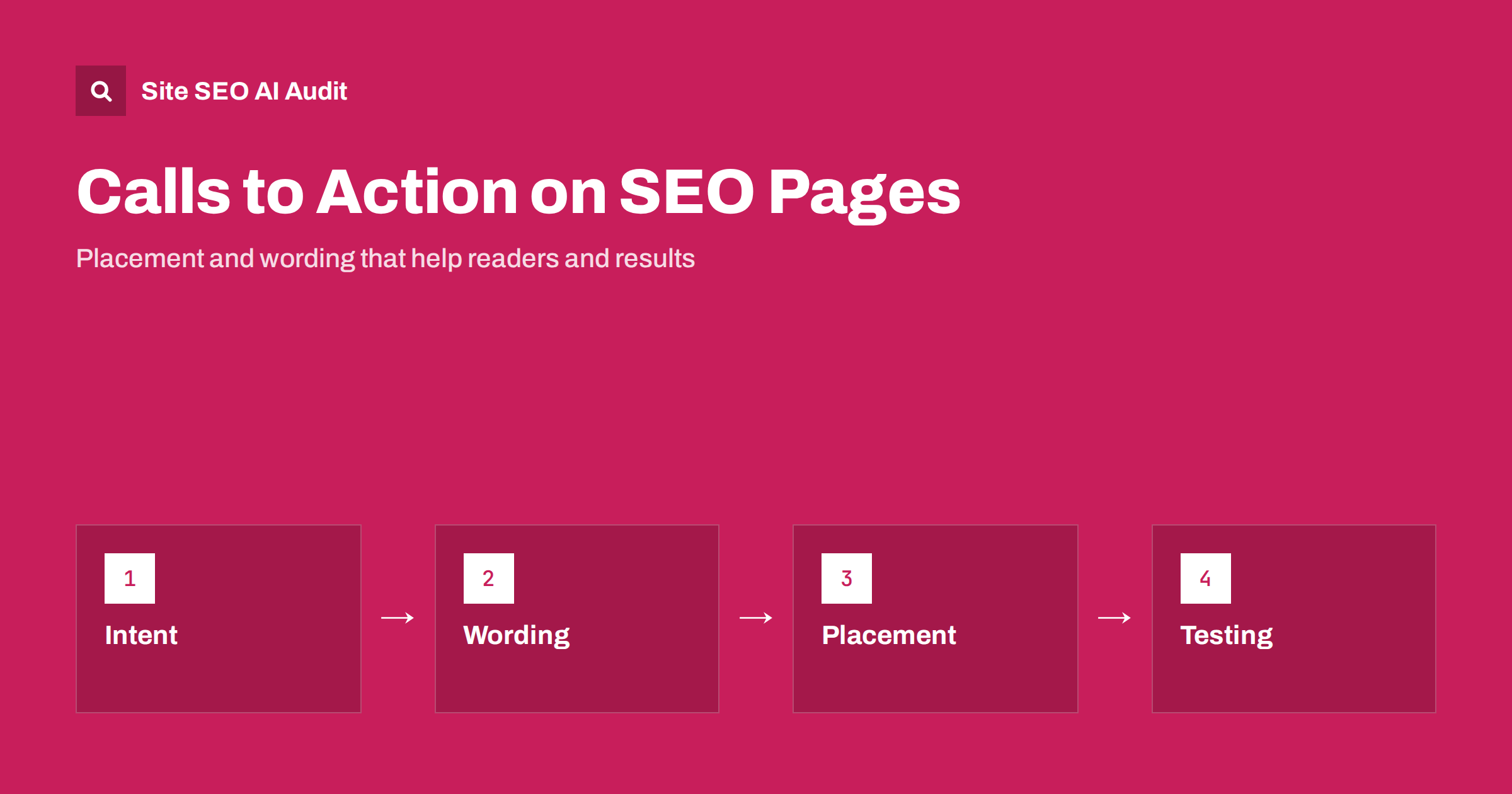
Short answer: A call to action (CTA) on an SEO page works when it matches what the visitor wants at that moment. Offer one clear next step, word it as a specific benefit, place it after the page has delivered value, keep pop-ups and banners from blocking the content, and measure the result with real goals. A CTA that interrupts the answer can raise exits and annoy readers, while a helpful one turns traffic into leads, sign-ups or sales.
Traffic is only a first step. A page can rank well and still earn nothing if visitors do not know what to do next. Some sites overcorrect and cover every article with banners, forms and pop-ups, which spoils the experience and can weaken the page in search. The balance is to treat the CTA as part of the content: a natural continuation of the answer. This guide covers how to choose the action, write the words, decide the position, avoid intrusive designs and test what works.
Match the CTA to search intent
Different searches come from different stages. A person reading “what is a content audit” wants to learn. A person searching “content audit service price” is ready to compare options. Offering a demo on the first page is too early, and offering only a definition on the second wastes the visit. Use this simple map:
- Learning: offer a related guide, a checklist, a template or a newsletter that deepens the topic.
- Comparing: offer a comparison, a calculator, an example or a sample report.
- Ready to act: offer a clear action such as starting a trial, requesting a quote or placing an order.
Look at the query and at what the results pages show before you decide. See search intent. Pages with mixed intent can have a soft CTA inside the text and a stronger one at the end. Landing pages built to convert follow other rules; see landing page SEO, and for service and product pages see service page SEO and product page SEO.
Write words that say what happens next
Good CTA text is short, specific and honest. It tells the visitor what they will get and what the next step costs them in time or effort. Compare:
- Weak: “Submit”, “Click here”, “Learn more”.
- Better: “Run a free audit of your site”, “Download the 10-point checklist”, “Get a quote in one working day”, “Compare the plans”.
Use verbs that describe the action, add the benefit and avoid pressure tactics, false urgency or claims you cannot support. If something is free or needs a card, say so clearly. Keep the promise: the page that follows must deliver what the button said. Only state limits and conditions that really exist on your site, and check them before you publish. A short line of reassurance, such as what happens after the click, can lift confidence. Keep the language consistent with the rest of the page and with your brand. Links should have descriptive text; see anchor text best practices.
Choose the position carefully
The best place depends on the page, but a few rules hold across most content:
- Answer first. Give the reader the short answer in the opening lines before asking anything. See answer-first introductions.
- Place a CTA where the need appears. If a section describes a task that a tool performs, a link to the tool fits there.
- Close with a clear next step. After the conclusion, a single action is natural. Readers who finish the page are the most interested.
- Keep the main content visible. On mobile, avoid fixed bars that cover text or buttons.
- Do not repeat the same CTA ten times. Two or three well-placed ones are enough for a long guide.
A short page, such as a pricing or contact page, may have the CTA near the top because the visitor arrives ready to act. Check how it works in practice with the page open on a phone. See pricing page SEO and contact page SEO.
Avoid intrusive designs
Search engines evaluate how usable a page is, and visitors react quickly to annoying elements. Avoid:
- Pop-ups and overlays that cover the main content right after arrival, particularly on mobile. See pop-ups and interstitials.
- Banners that push the main text below the fold. See above-the-fold content.
- Elements that load late and shift the layout when they appear. See how to fix Cumulative Layout Shift.
- Cookie and consent banners combined with other overlays that make the page hard to use.
- Buttons that look like content or links disguised as something else.
If you need a pop-up, make it easy to close, delay it until the visitor has engaged and keep it small. Legal notices and consent requests are different and must follow the rules that apply to you, but design them to be as unobtrusive as the law permits.
Keep CTAs crawlable and consistent
A CTA that is only a script-driven button may not be a link at all. Use a normal anchor element with a destination URL, so crawlers and assistive tools can follow it. Link to the right page, not through a redirect chain, and keep the destination indexable if it is meant to be found. Tracking parameters should not create duplicate versions of the page; see URL parameters and duplicate content. If your site has several languages, send each version to the matching language page. Forms and checkout pages often should not be indexed, but make that choice deliberately. See noindex vs robots disallow.
Test and measure what matters
Measure the outcome you care about, not just clicks on the button. Define goals such as completed sign-ups, quote requests or purchases, and track them by landing page and source. Look at:
- The click rate of each CTA, by position and device.
- The conversion rate of visitors who arrive from organic search to each key page.
- Engagement signals such as scroll depth and the next page visited.
- Whether changes in layout affected speed and layout shift.
- Qualitative feedback from support and sales teams about what visitors ask.
Run one change at a time and let the test run long enough to cover a normal cycle of traffic. Small sites may not have enough visits for a statistical test; in that case use before-and-after comparisons and common sense. Keep the version that serves visitors best, even when a more aggressive design gets more clicks, if it reduces satisfaction. Check the SEO side with the performance data in Search Console to be sure rankings and click-through did not suffer.
Audit your CTAs across the site
Review your top organic pages one by one. Does each have a next step that fits its intent? Are the words specific? Are the links real links? Does anything block the content? Then check the technical side across the whole site: broken CTA links, redirects, slow pages and missing titles. Site SEO AI Audit finds broken links, links to redirects, empty anchors, speed problems and on-page issues on every page, and the first audit of up to 200 pages is free. Use the fix list to clean up before you start testing new wording.
Examples for common page types
Concrete cases make the principles easier to apply. On an informational guide, a good CTA might be a link to a related checklist or a free tool that performs the task the article explains. On a comparison page, offer a short table of options with a clear button for each one, and say which type of customer each option suits. On a category page for an online shop, keep the main action on the product cards and avoid large banners above the products. On a service page, repeat one primary action, such as requesting a quote, and add a phone number or form for people who prefer another route. On a blog post written for awareness, a newsletter box at the end is enough.
Also consider accessibility. Buttons need enough contrast, a visible focus outline and text that makes sense when read aloud on its own. A label such as “Start free audit” is better than “Go”. Make touch targets large enough for fingers and leave space between them so that people do not tap the wrong thing. These details help every visitor, reduce errors and support the same quality signals that search engines look for. See web accessibility and SEO for more on the overlap.
Related reading
- Landing page SEO
- Pop-ups and interstitials
- Search intent: matching your page to what searchers want
- How to optimize a blog post for SEO
The bottom line
A good CTA is the natural next step of a helpful page. Match it to the visitor’s intent, word it clearly and honestly, place it after you have delivered value, keep it light and crawlable, and judge it by real outcomes. Treat it as part of the content, and it will help both readers and results.
FAQ
How many calls to action should a blog post have?
Usually one main action, repeated in at most two or three natural places for a long article. Too many compete for attention.
Do calls to action affect rankings?
Not directly. They can matter indirectly if they hurt usability, for example by covering content, slowing the page or shifting the layout.
Should a CTA be a button or a text link?
Either works. Use a button for the main action and text links inside sentences for lighter suggestions. Both should be real links with clear wording.
Where is the best place for a CTA?
After the page has answered the question, and wherever the text creates a need for the action. Avoid blocking the opening content.
How do I know if a CTA works?
Track completed goals by landing page and source, compare click rates by position and device, and check that speed and rankings stayed healthy.