ENEnglish
 LTLietuviškai
 DEDeutsch
 FRFrançais
 RUРусский
 ESEspañol
 PLPolski
 ITItaliano
 UKУкраїнська
 CSČeština
 PTPortuguês
 JA日本語
JA日本語 LVLatviešu valoda
 ETEesti
 HUMagyar
 IDBahasa Indonesia
 TRTürkçe
 HIहिन्दी
 ELΕλληνικά
 ARالعربية
 THไทย
THไทย VITiếng Việt
 RORomână
 MSBahasa Melayu
 BNবাংলা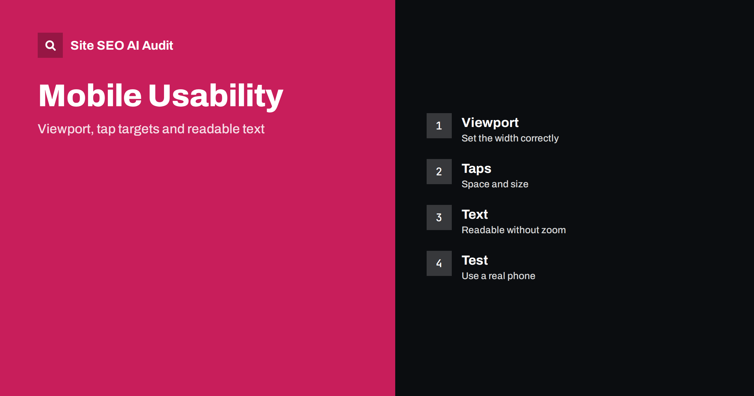
Short answer: Mobile usability means that a page is comfortable to read and use on a phone. Set a proper viewport meta tag, make text readable without zooming, give buttons and links enough size and space, avoid content that is wider than the screen, and keep fixed bars and pop-ups from covering the page. These basics improve conversions and support search performance, since most indexing is based on the mobile version.
Open your website on a phone and try to do the thing a customer would do: read an article, find opening hours, add a product to the basket or send a message. If you have to pinch to zoom, scroll sideways, tap a link three times or close a banner that covers the whole screen, you have found a mobile usability problem. These issues are easy to miss on a large desktop monitor, yet they can cost you visitors and sales every day. This guide explains the most common problems, why they happen and how to fix them in a practical order.
Why mobile usability matters
For many sites, most visits now come from phones. Search engines also index the mobile version of pages first, so what works on a phone is the version that is judged. A page that is hard to use on a small screen sends poor signals through behaviour, such as quick exits, and may lose conversions even when it ranks well. Usability is not a single ranking switch, but it is part of the overall experience that search engines try to reward, and it overlaps with speed and layout stability; see what must match on mobile and desktop and Core Web Vitals in plain words.
Search Console used to include a dedicated mobile usability report, and some tools and lighthouse-style checks still test the same issues. Even when a particular report is not available, the underlying problems are real and worth checking by hand and with a crawl.
Set the viewport correctly
The viewport meta tag tells the browser how wide to make the page on a small screen. Without it, many phones draw the page as if the screen were a desktop width and then shrink it, so text becomes tiny. Almost every modern site should have this line in the head of each page: a viewport tag with the width set to the device width and an initial scale of one. Check three things:
- The tag is present on every template, including landing pages, checkout pages and error pages.
- The width is set to the device width, not to a fixed number of pixels.
- You do not block zooming. Settings that disable user scaling harm accessibility, and many browsers ignore them anyway.
If your theme or builder creates the tag, view the page source to confirm it. Missing or wrong viewport tags are a classic cause of pages that look broken on phones.
Make text readable without zoom
Body text should be comfortable at normal phone distance. As a general rule, a base size of about 16 pixels works well for body text, and smaller text should be limited to labels and captions. Use relative units so that the text responds to the user’s own settings. Pay attention to line length and spacing: a narrow screen with long lines of tiny text is tiring. Keep strong contrast between text and background, since phones are used outdoors in bright light. These points also overlap with accessibility; the article on web accessibility and SEO explains the connection. Readability is more than size, and the guide on readability and SEO covers wording and layout.
Fonts matter too. Heavy custom fonts can delay the first view of text on slow connections, so use sensible fallbacks and loading rules; see web fonts and page speed.
Size and space tap targets
Fingers are bigger and less precise than a mouse pointer. Buttons, links, form fields and menu items need enough size and enough space around them to be tapped without error. Common guidance suggests a target of roughly 44 to 48 pixels in each direction, and a gap between neighbouring targets so that one tap hits only one thing. The problems appear mostly in these places:
- Lists of links close together, such as footer menus and tag clouds.
- Inline text links in tight paragraphs.
- Small close buttons on banners and pop-ups.
- Icons for share, cart or search that are drawn small without extra padding.
- Form controls such as checkboxes and radio buttons.
You do not have to enlarge the visible icon. Often it is enough to add padding so that the tappable area is larger than the drawing. For navigation, see navigation menus and footer links.
Avoid content wider than the screen
If visitors must scroll sideways to read a page, something is wider than the viewport. The usual causes are fixed-width images, tables, embedded videos and maps, code blocks, long unbroken words and layouts built with fixed pixel widths. Fix them by making media flexible: set images and embeds to scale down to the width of their container, let tables scroll inside their own wrapper or reformat them for small screens, and allow long text to wrap. The guide to responsive images with srcset and sizes explains how to serve the right image for each screen, and HTML tables and SEO covers tables that stay readable.
Check also for horizontal scrolling caused by a single element that overflows, such as a wide button or a banner. A quick way to find it is to test the page at a narrow width and look for the element that sticks out.
Handle fixed bars, pop-ups and banners
Small screens have little space, so anything fixed in place can take over the page. Sticky headers, chat widgets, cookie notices, app install banners and newsletter pop-ups often stack on top of each other and leave only a thin strip of content. Limit the number of overlays at one time, keep fixed headers slim, and make sure each overlay can be dismissed with a large, clear control. Consent banners should not hide the whole page; see cookie banners and SEO. Intrusive pop-ups that cover the main content after a visitor arrives from search are a known problem, covered in pop-ups and interstitials.
Think about the first screen as well. Visitors should see a clear heading and the start of the content without scrolling past huge images or banners; see what the first screen should show.
Keep the mobile page complete
Do not remove content to make the mobile page shorter. If the mobile version shows less text, fewer links or missing structured data compared with the desktop page, the indexed version will lack them as well. Use collapsed sections or tabs where space is limited, but keep the content in the page code. Make sure images and videos are available and not blocked, and that important links are in the mobile menu.
Forms deserve special attention. Use the right input types so that the phone shows the correct keyboard, label each field clearly, allow autofill, and keep error messages visible near the field. Long forms on a small screen lose many visitors, so ask only for what you need.
How to test
Start with the simplest method: use your own phone. Open your most important pages, such as the home page, a product or service page, the contact page and checkout, and complete a real task. Then use the device emulation in a browser to try other widths and orientations. Look for sideways scrolling, tiny text, overlapping elements and hard-to-tap controls. Ask a colleague or customer who does not know the site to try the same tasks while you watch.
For larger sites, use a crawl and a speed tool to find patterns across templates. A mobile page that is also slow loses visitors before they see the content; see PageSpeed Insights: lab and field data. Site SEO AI Audit checks your pages across seven areas, including speed and Core Web Vitals, and gives a fix list ranked by points. The first audit of up to 200 pages is free, and the pricing page shows how to re-check after changes.
Related reading
- Mobile-First Indexing: What Must Match on Mobile and Desktop
- How to Fix Cumulative Layout Shift (CLS) on Your Site
- Above the Fold: What the First Screen of a Page Should Show
- Pop-Ups and Interstitials: Which Ones Hurt SEO?
The bottom line
Most mobile usability problems have simple causes: a missing viewport tag, small text, cramped tap targets, content that is too wide and overlays that cover the page. Fix them in that order, keep the mobile version complete and test on a real phone. A site that is pleasant on a small screen serves both visitors and search engines.
FAQ
Do I still need the viewport meta tag?
Yes. Without it, many phones render the page at desktop width and shrink it, which makes text tiny and the page hard to use.
What is a good size for tap targets?
Aim for roughly 44 to 48 pixels in each direction, with space between neighbouring targets. Extra padding can enlarge the tappable area without changing the icon.
What font size should body text have on mobile?
About 16 pixels is a good base for body text. Use relative units and keep strong contrast so that text stays readable in bright light.
Can poor mobile usability affect rankings?
It is not a single ranking switch, but it affects the experience that search engines evaluate and the behaviour of your visitors, so it can influence results and conversions.
How do I find pages that scroll sideways?
Test at a narrow width and look for the element that overflows, often a wide image, table, embed or button. Make it flexible or give it its own scroll area.