ENEnglish
 LTLietuviškai
 DEDeutsch
 FRFrançais
 RUРусский
 ESEspañol
 PLPolski
 ITItaliano
 UKУкраїнська
 CSČeština
 PTPortuguês
 JA日本語
JA日本語 LVLatviešu valoda
 ETEesti
 HUMagyar
 IDBahasa Indonesia
 TRTürkçe
 HIहिन्दी
 ELΕλληνικά
 ARالعربية
 THไทย
THไทย VITiếng Việt
 RORomână
 MSBahasa Melayu
 BNবাংলা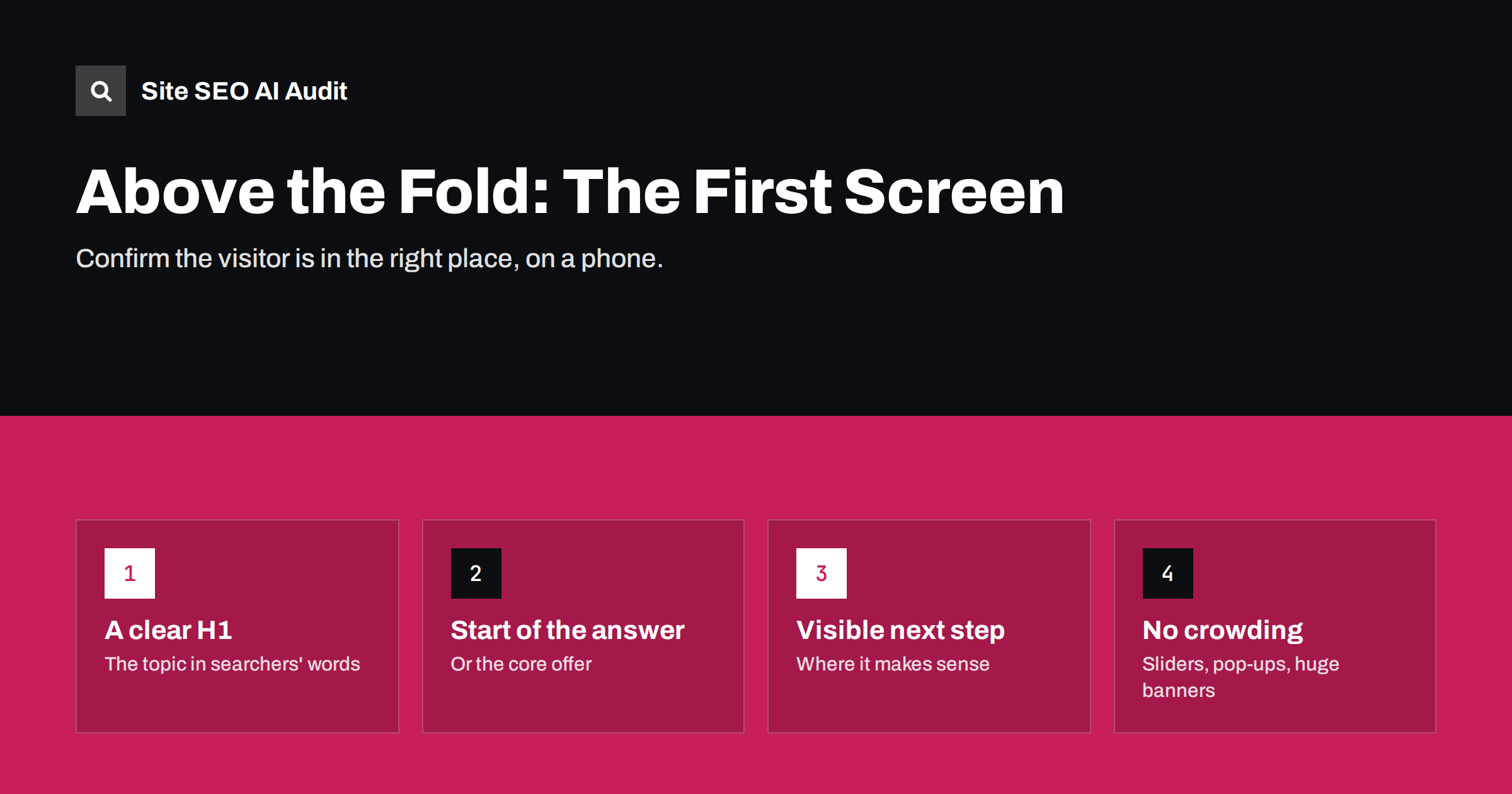
Short answer: “Above the fold” is what visitors see before they scroll. For SEO and usability, that first screen should confirm the page matches the search: a clear H1, the start of the answer or the core offer, and a visible next step. Large banners, sliders, pop-ups and ads that push the content down frustrate visitors and can slow the page. Design the first screen for the phone first, where space is smallest.
What “above the fold” means on the web
The phrase comes from newspapers, where the most important stories were printed on the top half of the front page, visible when the paper was folded on a newsstand. On the web, the fold is the bottom edge of the browser window when a page first loads. Everything visible without scrolling is above the fold.
There is no single fold. It depends on the device, screen size, browser and even whether a cookie banner is showing. A laptop might show twice as much as a phone. That is why it is more useful to think about “the first screen on a typical phone” than about a fixed number of pixels.
Why the first screen matters
People decide very quickly whether a page is worth their time. After clicking a search result, the first screen is where they check that they landed in the right place. If it shows a large stock photo, a vague slogan and a newsletter pop-up, many will return to the results without scrolling.
For search, that matters in several ways:
- Satisfaction. Search engines aim to show pages that satisfy searchers. Pages whose visitors consistently give up quickly are unlikely to hold strong positions.
- Intrusive interstitials. Google has long said that pop-ups and overlays that cover the main content, especially on mobile right after arriving from search, make a poor experience and can affect how pages perform.
- Page experience and speed. The largest element in the first view is often what the Largest Contentful Paint metric measures. A huge hero image or slider can make that element slow to appear.
- Layout shifts. Banners and ads that load late and push content down cause layout shifts, which frustrate readers and are measured as Cumulative Layout Shift.
What belongs in the first screen
The first screen should answer one question for the visitor: “Is this what I was looking for?” In practice that means:
- A clear H1 that names the topic, product or service in the searcher’s words.
- The start of the answer or offer. For an article, the direct answer or its first sentences. For a service, what you do, for whom and where. For a product, the name, price and main image.
- A visible next step where one makes sense: a button to buy, book, call or start, or simply the flow of content that invites scrolling.
- Enough context to trust the page: a recognizable brand, and for articles perhaps the author and date.
This does not mean cramming everything into the first screen. A calm first screen with one clear message works better than one packed with buttons, badges and offers competing for attention. The aim is recognition: the visitor should see at once that the page is about what they searched for.
Everything else, such as long introductions, galleries, testimonials and newsletter sign-ups, can come further down.
Common things that crowd out the content
| Element | Problem | Better approach |
|---|---|---|
| Full-screen hero image | Pushes all text below the fold on phones; often slow | A shorter image or none; text first on mobile |
| Rotating slider | Messages rotate away before they are read; heavy | One clear message |
| Pop-ups on arrival | Cover the content immediately | Delay, or show only after meaningful engagement |
| Large cookie banner | Covers much of a phone screen | A compact banner that does not block reading |
| Ads above the content | Visitor must scroll past to find anything | Place ads within or after the content |
| Oversized header and navigation | Takes a third of the screen | Compact header, especially on mobile |
| Long breadcrumbs and meta lines | Push the H1 down | Keep them short |
Legally required notices such as cookie consent are not optional, but their design is. A consent banner can meet requirements without covering half the page.
Mobile first
Most of the time, the smallest screen is where problems appear. A layout that looks balanced on a desktop can show only a logo, a menu button and the top of a photo on a phone. Check every important template on a real phone:
- Is the H1 visible without scrolling?
- Does the first screen contain at least the beginning of the answer or offer?
- Do any pop-ups, banners or chat widgets cover the content?
- Does the layout jump as images, ads or fonts load?
Search engines primarily use the mobile version of pages for indexing and ranking, so the mobile first screen is effectively the first screen that counts.
Page types: what the first screen should show
- Articles and guides: H1, the short answer, and possibly a table of contents.
- Service pages: H1 naming the service and location, one sentence on what is included or why you, and a contact button.
- Product pages: product name, main image, price, availability and add-to-cart button.
- Category pages: category name, a one-line introduction and the first row of products. Long category text belongs below the products.
- Home page: what the business does, for whom, and the main next step.
Do not hide content to make the fold look clean
Some designs put important text into collapsed accordions, tabs or “read more” toggles to keep the first screen tidy. Search engines can generally read content in tabs and accordions that is present in the HTML, so this is usually fine for structure. But be careful with the answer itself: if the key information is collapsed, visitors may not find it. Keep the core answer visible and use collapsible sections for secondary detail such as specifications or FAQs.
Before and after: a service page on a phone
Consider an illustrative plumbing company’s service page as it first appears on a typical phone.
Before: a cookie banner covering the bottom third of the screen, a header with a large logo and a phone number bar, and a full-width photo of a smiling plumber with the words “Your Trusted Partner” across it. The H1, “Emergency Plumbing in Leeds”, sits just below the fold. A chat widget bubble covers part of the photo. A visitor sees a logo, a slogan and a stock photo; nothing confirms that this company handles emergency call-outs in their city.
After: a compact cookie banner along the bottom edge, a slimmer header, and no hero photo on mobile. The first screen now shows the H1 “Emergency Plumbing in Leeds”, the sentence “24/7 call-outs across Leeds, usually within two hours. Fixed call-out fee, no hidden charges.”, and a large “Call now” button. The photo moves further down, next to the section about the team.
Nothing about the business changed, only the order and size of elements. The visitor now knows within a second that they are in the right place, and the page’s main message is in text that search engines can read.
How to review your templates
- List your main templates: home, article, service, product, category, landing page.
- Open one example of each on a phone, in a private window so banners and pop-ups appear as they do for new visitors.
- Screenshot the first screen and ask: does it show the H1 and the start of the answer or offer?
- Note every element that takes space before the content and decide whether it earns its place.
- Fix at the template level, then recheck on several screen sizes.
Some related issues can be measured across the site. Site SEO AI Audit checks H1s on every page, runs speed checks including Largest Contentful Paint and layout shift, and flags heavy pages, with fixes ranked by how many points they add. See the plans or run a free first audit.
Related reading
- Answer-First Introductions: How to Open a Page That Ranks
- Core Web Vitals Explained: LCP, INP and CLS in Plain Words
- Home Page SEO: What Your Home Page Must Say and Link To
The bottom line
The first screen is where visitors decide whether to stay. Use it to show a clear H1, the start of the answer or offer and a visible next step. Keep hero images modest, avoid sliders and immediate pop-ups, design compact banners and headers, and check every template on a phone. A first screen that confirms the searcher is in the right place helps both people and the pages’ performance in search.
SSS
Does content above the fold rank better?
Search engines read the whole page, so content below the fold is indexed too. But pages whose first screen is mostly ads or pop-ups give a poor experience, which can affect how they perform. Put the main content early.
Are pop-ups bad for SEO?
Intrusive pop-ups that cover the main content right after a visitor arrives from search, especially on mobile, are discouraged by Google. Required notices and small, unobtrusive banners are generally fine.
Should the call to action be above the fold?
On service, product and landing pages, usually yes, so ready visitors can act immediately. Repeat it further down for visitors who need more information first.
Is text in tabs or accordions indexed?
Generally yes, if it is present in the page’s HTML. Keep the core answer visible, though, and use collapsible sections for secondary detail.
Where is the fold on a phone?
It varies by device and browser, and cookie banners change it further. Check your templates on a few common phones rather than designing for a single fixed height.